


Last year, PepsiCo started printing real potatoes onto every bag of Lay’s. The reason? In a world where people are increasingly concerned about the provenance of their food, 42% of the population didn’t realize that the world’s most popular potato chip was made from potatoes.
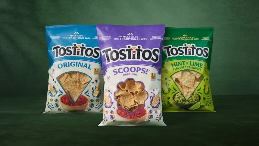
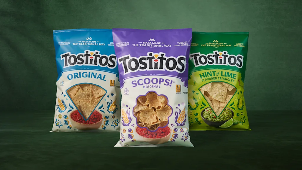
So they put a potato on the packaging. And now, the company is updating Tostitos bags—the most popular plain tortilla chip in the world—with a similar strategy. While Lay’s got a dose of potatoes, naturally, all Tostitos bags feature corn.
“We started by being really honest with ourselves. The research was telling us that the old packaging wasn’t working—it was actually reinforcing a lot of the wrong perceptions,” writes Hernán Tantardini, CMO of PepsiCo Foods, over email. “People saw Tostitos as a party brand. The quality and craft story wasn’t coming through at all.”
Technically speaking, Tostitos are classified as an ultra processed food, due to their use of refined seed oils. But they still feature a stupid simple and clear ingredient list: Corn, oil, and salt. 71% of consumers are reading labels more closely than before, and the front of the bag is a gateway to the back.
The bags used to read “no artificial flavors, colors, or preservatives” right up top. Now they promise “Masa made in the traditional way,” with these other notes sidelined. The result is repositioning Tostitos as a more authentic and culturally-born product, anchoring Tostitos in the old way of doing things—which aside from signaling quality and cachet, tends to be more natural.
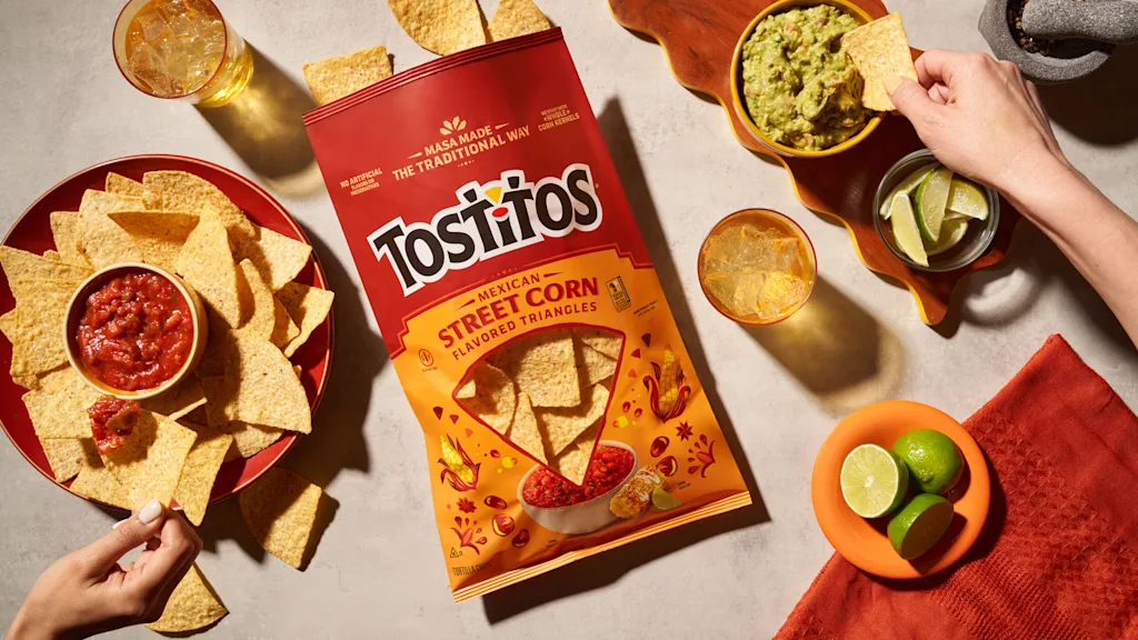
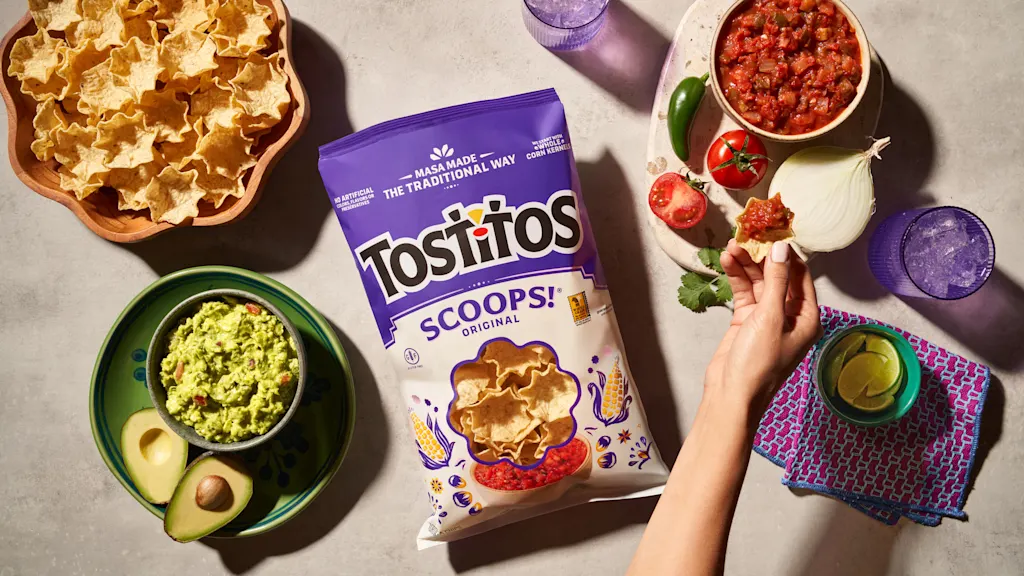
As for the actual corn, that’s presented in an entirely different way than Lay’s. For Lay’s, PepsiCo photographed countless real potatoes in different presentations. For Tostitos, it opted for illustration—to tie it back to that idea of masa production, a complex process known as nixtamalization in which corn is treated with lime to make it more digestible and nutritious for consumption in tortillas, sopes, and other Mexican delicacies.
“We looked at photography, but the more we explored it, the more it felt like it belonged to a different brand,” says Tantardini. “Tostitos has this warmth to it—this sense of joy and togetherness that’s been a part of its DNA forever. Photography felt too polished, too literal. It would’ve flattened something that’s actually quite live.”
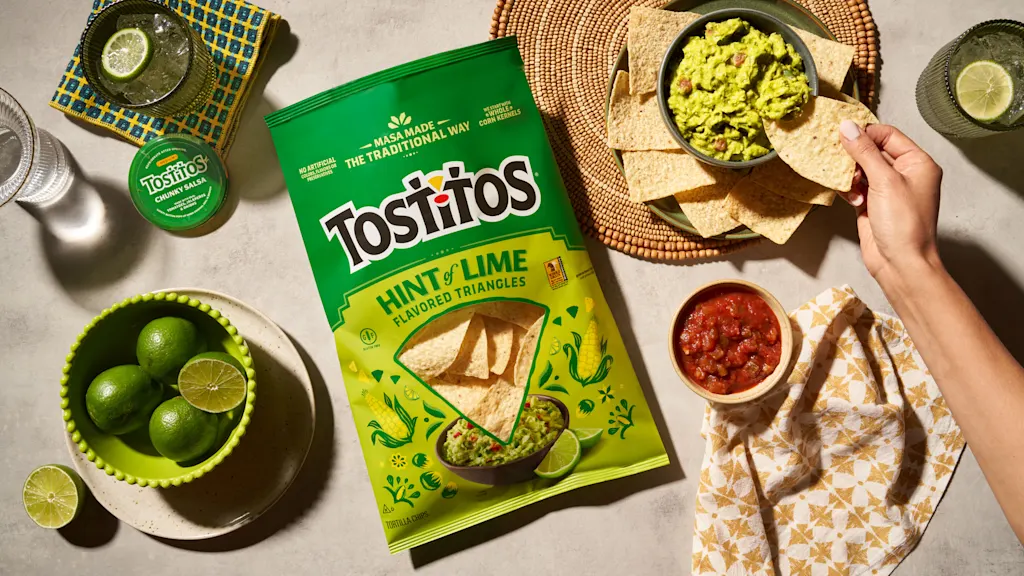
The illustration has an imperfect, hand painted feel—and your eye reads a human touch beneath the perfectly machined Tostitos wordmark. I find myself wishing that PepsiCo went even further, and embraced xilografía (the woodblock printing out of Mexico) with elements like the window frame or even subheading labels. But the two tone kernels and cobs of corn on Scoops and Street Corn varieties really are quite pretty for a mass market snack chip. While many of the colors are technically the same on the old and new packages, the chosen hues are softer and intentionally read warmer, with a basis in earth tones, according to the company.
That said, Tostitos doesn’t read like some half-apologetic Trader Joe’s snack brand, unsure if it’s there to party or to apologize for the indulgence. The bags still read like a celebration. In a final, playful twist, the front window—which reveals the actual chips through the bag—now dips itself right into a large bowl of salsa or guacamole sitting below. (The old version featured photorealistic jarred Tostitos salsa on the side, like an overzealous advertisement.)
This entire approach to craft could help Tostitos—which has ceded a few percentage points in sales volume since raising prices in 2022/23—compete with smaller batch brands that have cut ever so slightly into its market share. PepsiCo did validate the approach in test stores, while consumers will see the new rollout over the coming months.
“From a business perspective, this is really about changing perception where it matters most,” says Tantardini. “If we can use packaging to clearly signal craft, quality, and care, we can rebuild confidence in the brand and lower the barrier for people who’ve drifted away because they didn’t realize the craft and care that goes into our chips and dips. That’s the opportunity. And that’s what we designed for.”
