


When’s the last time you thought about pepper?
Designers working in the consumer packaged goods category have reimagined many a pantry staple over the past several years, including olive oil, tinned fish, and even chili crisp, but pepper has remained as forgotten as it is ubiquitous. A playfully chunky new brand is giving the category design intentionality, functionality, and visual appeal—and could point to where food brand design is headed.

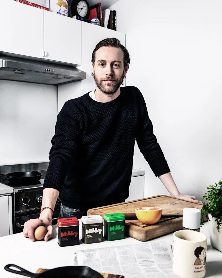
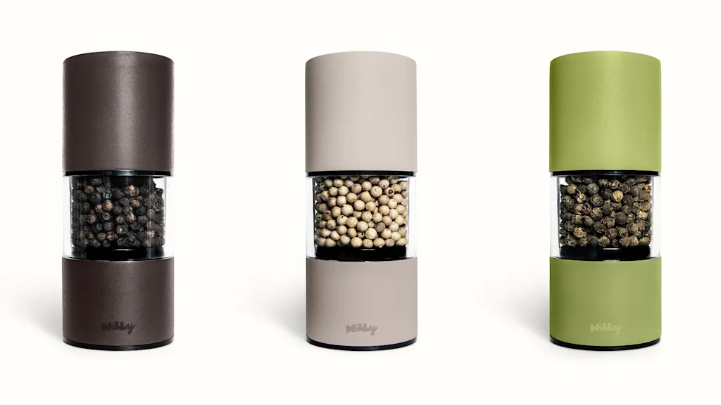
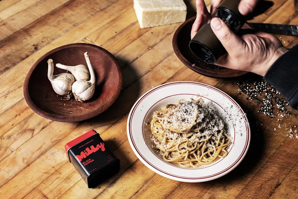
Michael Laniak, a former line cook, launched Milly on May 12 as a result of his failed attempt to source pepper in the same way he could olive oil or sea salt. Milly sells only whole peppercorns—black, white, and green—along with namesake matching pepper mills in coordinated colors.
The products are available on the company’s website, starting at $14 for one tin of whole peppercorns, $28 for a pepper and mill set, and $78 for the trio of peppers and mills. Considering there’s nothing else quite like it, what we’re seeing on a small scale is the reinvention of a category, and it’s just begging for well-packaged competitors to vie for counter space next to some Graza and a well of Maldon salt.

Its branding and positioning are what make this new product notable, with a hand-lettered logo and thoughtful design system that refocuses what many might dismiss as a good-enough spice into an experience you might want to consider more thoughtfully (and either gift or spend more on).
The logo itself draws a playful contrast to category competitors, which offer run-of-the-mill serifs on white or black backgrounds (or red, for McCormick). Milly’s in-house designer, Cassie Scowcroft, hand-lettered the final design, which has an organic, analog look, thanks to the high-contrast weight variations of its strokes, a mix of upper- and lowercase letters, and a script y. It’s a nod to the fact that, according to the company, the peppercorns are handpicked.
The color accents used on the tins purposefully reflect the flavor profile of each peppercorn, all derived from the same plant but harvested and/or processed differently to achieve a variety of notes. Red nods to black pepper’s boldness and spice; bright green embraces green pepper’s fresh, floral profile; and cream on brown hints at white pepper’s subtle, earthy flavor.
The logo’s organic, blocky look and bold color pairings call to mind other brands in the food space, like the Roman restaurant Roscioli (which also opened in New York in 2023) and the new Gourmet, which, if in a very obvious way, graphically stuck it to the old institution by creating a publication in complete graphic opposition, using an asymmetric, uneven, informal logo. (Perhaps a chunky, hand-lettered micro trend is on the way in food branding?)
The playfully contemporized geometric asymmetries of Milly and Roscioli also call to mind the graphic style of Italian Amaro labels from the last century and before, and the newer Amaro brand Faccia Bruto by studio GEO NYC, whose blocky type, bold color, and contrasting line illustrations are gorgeously anachronistic.
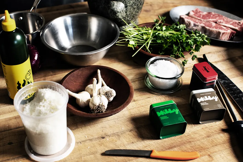
While the tins are initially difficult to pop open (I’m told this is for freshness), Milly’s packaging system makes adding pepper to a dish feel special. And unlike those of competitors, Milly’s mills are refillable, reducing waste and perhaps increasing return customers.
Peppercorn might be an afterthought. But so was olive oil. And then came Graza.
