


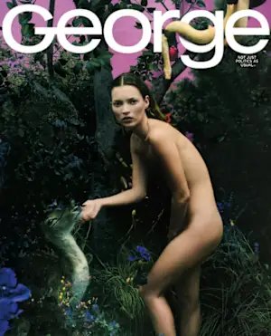
It was 1997, and Matt Berman, the creative director of JFK Jr.’s George magazine, had just gotten back to his hotel in Los Angeles. He had left the ‘Garden of Eden’ style set he’d concocted for the cover of the September issue: lush with greenery and replete with live animals. It would reach peak ripeness once the star, Pam Anderson, arrived on set the next day as the “first woman,” to illustrate a feature on the 20 most fascinating women in politics.

But there was a problem. A note was waiting for him at the front desk of the hotel. It was from Anderson. She was canceling. “She was like, ‘I can’t, a million apologies,’” recalls Berman. “Something like that. It was just crazy.” Amazingly, he secured Kate Moss that night through her former boyfriend Mario Sorrenti, who’d arrived to photograph the shoot. You wouldn’t guess from the talent, set design, and tabloid-like plot twists that this was for a political magazine.
But that was the creative—and challenging—conceit of George: to dust off politics and give it broad, glossy appeal. “He wanted a magazine that would seduce people, and that comes from the fashion world, the music world; different, other kinds of magazines in the world I came from at Elle,” says Berman of his former friend and boss, who died in 1999 at age 38.
For the issue, Kennedy Jr. posed as Adam in his illustriously candid, bantering editor’s letter (no image, sorry). And he suggested he was clued into the criticism: “I’ve heard about substance abuse, and I’m staying away from substance,” he wrote. “To whom much is given, much is expected, right?” An apple dangled overhead. The insider and Berman, a young artistic director outsider, encouraged readers to take a bite.
HOW IT STARTED
George launched in September 1995 after Kennedy Jr. secured a publishing deal with Hachette. Berman, who was in his late 20s at the time, had been working at another Hachette publication, Elle, where he collaborated with its iconic founding editor Régis Pagniez. “They introduced me to John as the guy who’s going to get him up and running, and I’m going to do his logo and his prototype, and they’re going to go out and sell the magazine,” says Berman. “I was installed in a conference room with John and his business partner and his assistant. And we all became just really good friends.”
Kennedy ultimately had Berman stay on in a permanent role, and they became close creative collaborators in developing the magazine’s overall visual look. George was highly art directed and visually-forward as a way to trojan horse politics as a curated, sometimes campy fashion pub. Berman designed the logo (Univers, Kennedy picked it for the “Ge” ligature), the covers and their concepts and helped select talent, and everything on the pages in between.

“The general idea is to present politics, which can be kind of boring and dusty in a new way and a new lens, to capture people’s attention and imagination,” Berman says.
Once Kennedy had the magazine lineup, Berman would draw the entire thing out on tabloid paper from a Xerox machine and put it on the wall. “John would describe something, I’d be like, ‘Who’s that? Why is it interesting?’ And he’d keep talking until I latched onto something that I thought could work,” says Berman. “It was so organic and collaborative, and unique, the way we worked, because he never shamed me for not knowing politics.”
He wasn’t there because he knew politics; he was there because he knew fashion. George wasn’t a fashion magazine, but he was there to give it that look. Like Carolyn Bessette’s friends would want to buy it, Berman says. “That was the game,” he says. “How do you draw in someone who’s not that interested in politics, or remotely or peripherally interested?” Before the internet and social media, it was by using pop culture and magazines, he adds, and making it look completely different.
THOSE COVERS
The team did that through inventive art direction and the creative talent they hired. Berman hired magnum fashion photographers like Bruce Davidson and Nigel Perry for portraits. He hired graphic novel illustrators for drawings to run with stories. “Everything right away felt very different, because of the approach we had with who we were hiring to do all the work,” says Berman.
“Most of these subjects were in the newspaper, or in other political magazines, and never had a lot of art direction where you’d be able to create the vibe of the story, or communicate what the article’s about through something creative,” says Berman. “There were so many ways to do it, and we got really good at taking something completely not visual and making it visual. That was always fun to do with John.”
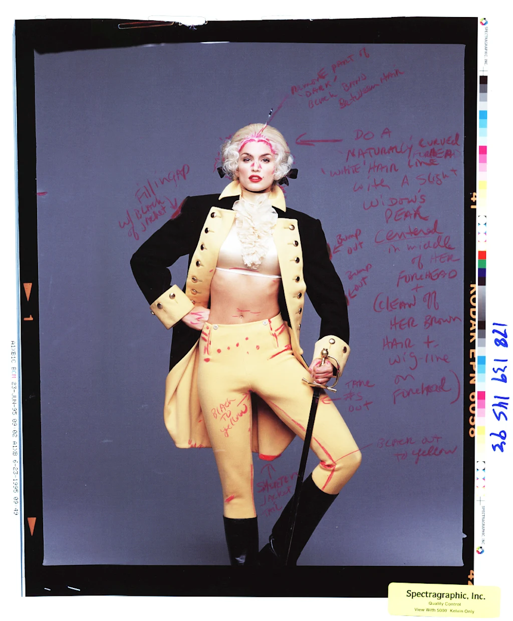
The best way to get a sense of this is through George’s covers, which initially had a super tight, highly editorial concept. Each cover star was dressed in period costume from George Washington’s era to illustrate the magazine’s namesake.
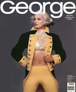
George launched with Cindy Crawford on the cover, making a powdered wig look the best it ever has. “We were discussing what to do for the Cindy cover, and Carolyn [Bessette] said, ‘Well, if you’re going to put just a model on the cover, it should be someone like Cindy, because she’s all-American. It’s apple pie; Midwest.’(The legendary hairstylist Oribe styled a wig from the Metropolitan Opera.)
“Cindy was a great one,” Berman says. He referenced the pin up artist Alberto Vargas, who did illustrations for Esquire, to style Crawford, and she posed at the same angle as Washington is on the quarter. “But, it was wacky,” Berman says. “It had to look like Cindy Crawford. It had to feel like George Washington.”
The cover that features Drew Barrymore as Marilyn Monroe is a favorite of Berman’s. “I put a team together of really interesting people, and it elevated everything,” he says. “You’ve seen a million people dressed up like Marilyn Monroe, but to get something that’s sophisticated and unexpected and kind of moody, that was the goal.” They manipulated the photo in the dark room to create a dreamy effect with unexpected tones. It also courted controversy, since Monroe sang “Happy Birthday” to Kennedy’s dad, and they pegged the cover to Bill Clinton’s birthday.
They shot four covers with supermodel Claudia Schiffer for the Clinton Dole race; one as a pinup and the other of her crying for each candidate’s prospective win and loss, “Dewey defeats Truman” style. They published after the results were in. “They were both really beautiful pictures,” says Berman.
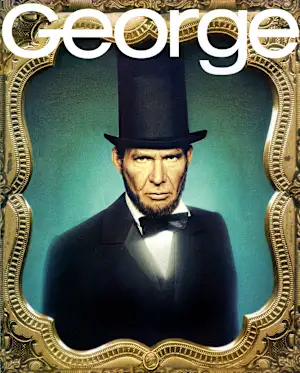
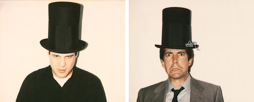
They shot Christy Turlington for a media issue. “People used to criticize John, like, he just puts nude women on the cover, which, it’s only happened… “ he counts. “Yeah, all right, so there are a few,” Berman says. George did have male cover stars, he points out: Charles Barkley, Robert DeNiro; Harrison Ford as Abraham Lincoln, another of his favorites. He took a daguerreotype camera from his mom, who was in the antique business, and adapted it to make a modern version.
“When you look at George, it’s a lot of John’s personality coming through, because he was a fun guy, and he was quirky,” recalls Berman. “You see all these elements of everybody, and of course. When the photographer comes in, and the stylist, and the hair and makeup, those people bring their elements.”
The tight historical inspiration prevented them from falling into creative copycatting. They didn’t have moodboards with the work of contemporaries. “Because there were costumes and historical figures, there wasn’t something we were copying a lot of the time. A lot of the time, the inspiration was a painting, or a statue, or, an old poster from a certain time. So there wasn’t that ‘Oh, I’ve seen that before,’ kind of feeling, because we didn’t have references to copy.”
He pitched Kennedy an “American Gothic” cover featuring him and Bessette, which ultimately didn’t happen. “I just could picture it, right, John, with the pitchfork and the overalls, and then her with her hair pulled back,” he says. “It would have been so good. But he wasn’t there yet. He was like, ‘I’m not gonna whore out me and my wife on the cover,’ you know? I say, ‘Come on, it’s such a fun idea—I mean, you did Marilyn!’”
For another, they concepted Jackie Onassis Kennedy their coverstar, sitting atop all of the books written about her. They asked Madonna to play the part, but she declined: “She sent a fax that said something cheeky, like, ‘No, John, I’m not gonna play your mommy,’ or something like that.”
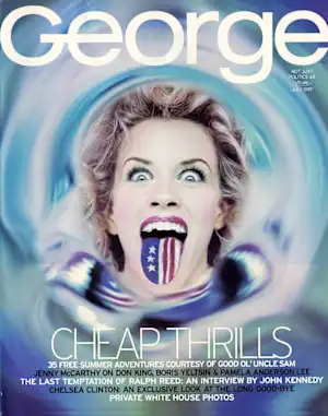
After a sales slump, Hachette wasn’t interested in the costumes either, suggesting they disguised the cover stars too much. George ending up losing some of the George. “We just had this experimental incubator, ‘let’s try it,’ kind of attitude,” says Berman. “The costumes were great, but it didn’t mean we had to do them forever.” Stéphane Sednaoui shot Jenny McCarthy for one cover. “That was just a wild, patriotic looking image.”
END OF AN ERA
George ceased publication six years after it started, in 2001, and about a year and a half after Kennedy passed away. For Berman, Kennedy’s death also occurred at a broader cultural tipping point. “We didn’t have anything yet,” says Berman. “We didn’t have Facebook, we didn’t have Instagram, nothing, nothing, nothing. So it was all very traditional. When John died is when the switch happened, because it was 1999, and then suddenly everything went digital. Everything changed a lot, and has been steamrolling since.”
The analog process of the ’90s gave George’s creative team more autonomy. No one saw photos from a shoot until Berman came back with the film, so there weren’t corporate approvers over their shoulders looking over images and he recalls a lot of space to try things and see if they worked.
“That was a huge advantage, because you didn’t have all these chefs on the project,” says Berman. “You start putting together all these requests people have, and it really, really dilutes the whole impact of an image.”
That’s harder to do today, Berman says. He now runs his own creative agency and says that after George, a lot of his clients have wanted to see a moodboard. “I didn’t get it, because I was coming from a place where we made the things that people made mood boards from,” he says.
Berman believes smaller brands need the freedom he had at George to come up with original ideas. “I think you’ve got to leave some element of creativity and surprise, a little respect for the team of artists who are going to make the images, or write the copy,” he says. “You need to leave a little room there, so some magic can happen, or some accidents can happen, or something surprising can happen.”
