


On January 22, President Donald Trump unveiled the logo for the Board of Peace, an international coalition his administration is forming to oversee the reconstruction of war-torn Gaza and address other global conflicts. There’s just one issue: The logo leaves out half the world.
Trump initiated the effort last year, but has expanded its scope since then, imagining an organization that he leads personally and that member countries pay at least $1 billion to remain a part of.
Longtime allies and NATO members including Canada, France, Italy, Norway, Sweden, and the U.K. are not members, while member nations include authoritarian countries or illiberal democracies like Saudi Arabia and Belarus that the nonprofit Freedom House rates as “not free.”
It’s “like if Law & Order: SVU starred Diddy,” Saturday Night Live’s Colin Jost joked about the board’s membership during SNL’s “Weekend Update” segment on January 24. Yet the group’s logo leans on the visual tropes of global peace to suggest a much different story.
A page from the past
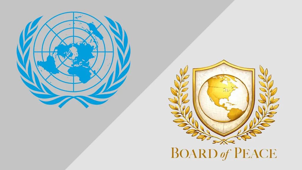
The logo for the group riffs off the U.N. emblem, but in typical Trump fashion, it’s gold—and cuts off more than half the rest of the world from the United States. Reaction online has been similar to the reaction to the board itself: negative.
A team led by American designer Oliver Lincoln Lundquist created the United Nations emblem in 1945. Lundquist was a World War II veteran who also designed the blue-and-white Q-Tip box and was on the team that designed the Chrysler Motors Exhibition at the 1939 New York World’s Fair, according to his 2009 obituary.
For the U.N., Lundquist and his team designed a mark showing the globe centered on the North Pole and encircled by a laurel wreath for the official badges worn by conference delegates. That mark was later modified to the current U.N. emblem by spinning it around so Alaska and Russia are on top of the world, and it’s now zoomed out to include more of the globe, as the original badge mark cut off Argentina and the bottom of South Africa and Australia. The U.N. Blue color used by the organization was chosen because it’s “the opposite of red, the war color,” Lundquist said.
Trump’s board logo is presumably gold because it’s Trump’s favorite color, and it centers roughly on the U.S. sphere of influence as Trump sees it, from Greenland to Venezuela, though Alaska is cut off and Africa peeks out. The logo is housed inside a shield instead of a circle.
A version of the logo initially shared by the White House X account has been criticized as made by AI (among its inaccurate details: a U.S.-Canada border that cuts off a big chunk of Ontario). A modified version of the logo that appeared onstage during the Board of Peace signing ceremony in Davos, Switzerland, was shinier and used a different map that covers roughly the same area.
Curiously, the logo’s map doesn’t include the very place the coalition was created to oversee. That means slides shared by the White House showing a nebulous timeline for a development plan of Gaza are all stamped with a logo that shows the U.S., but not Gaza.
Trump said at the signing that the Board of Peace represents the first steps to “a brighter day for the Middle East.” That’s not the story his logo tells.
