
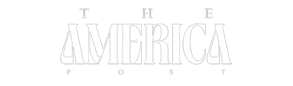


In this episode of “It’s all in the typeface,” Fast Company’s creative director Mike Schnaidt chose Kyoto for its handmade, human feel, blending Japanese calligraphy with classic Latin forms. Inspired by a process of exploration, its design reflects the human touch behind every page of this issue.
