


Most people don’t give the display screens on their commuter trains a second thought, but for designer Emily Sneddon, they’ve proved to be a well of inspiration.
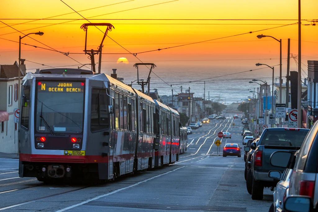
Sneddon lived in San Francisco, where she worked at the design agency Collins, from 2021 until this year when she moved back to her home country of Australia. She designed Fran Sans, her first ever font, after noticing the display on San Francisco Municipal Transportation Agency’s (SFMTA) recently retired Muni Metro Breda Light Rail Vehicle.
Unlike New York City, which handles its public transit through a single agency, the Metropolitan Transportation Authority (MTA), public transportation in San Francisco and the Bay Area is split between multiple independent public agencies, like SFMTA, Bay Area Rapid Transit (BART), and Caltrain, a commuter rail. That means there’s no de facto official font for public transportation in the Bay Area as there is in New York City with Helvetica, the official font of the city’s unified Metropolitan Transportation Authority (MTA).
So Sneddon made her own.
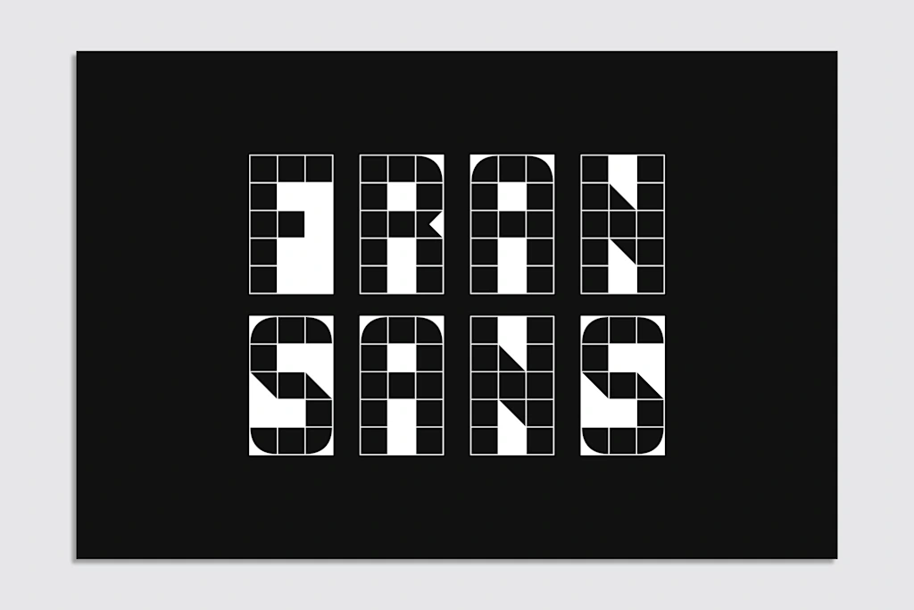
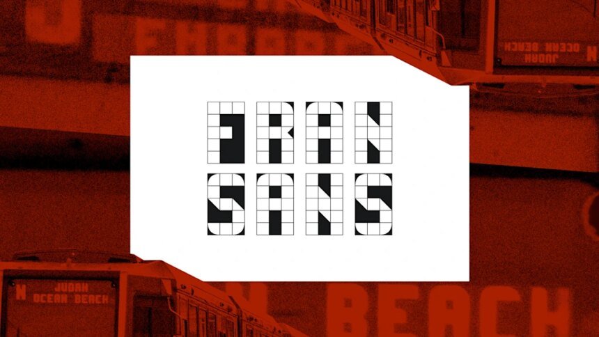
The font that became Fran Sans started first as a project documenting sans typography around San Francisco. The lettering from the train car display was supposed to be used on a zine cover—then it turned into a full-blown font.
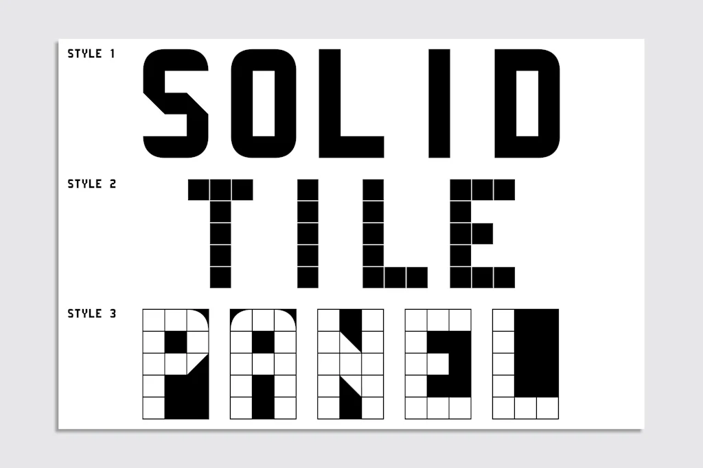
Sneddon designed Fran Sans on a 3×5 grid after a monthslong research project that included a visit to SFMTA’s Electronics Shop at Balboa Park, consultation with Gary Wallberg, a senior engineer who designed the display signs in 1999, and a survey of modular typography curated by Letterform Archive, which is based in San Francisco.
“For me it wasn’t enough simply to create a 1:1 without digging further to find out more about the original designer that inspired this work,” says Sneddon. “It’s a myth that we’ve all seemed to have subscribed to that everything you’d want to know about is available online. But so many stories are all around us, and they haven’t been documented anywhere. The story of these displays was one of them.”
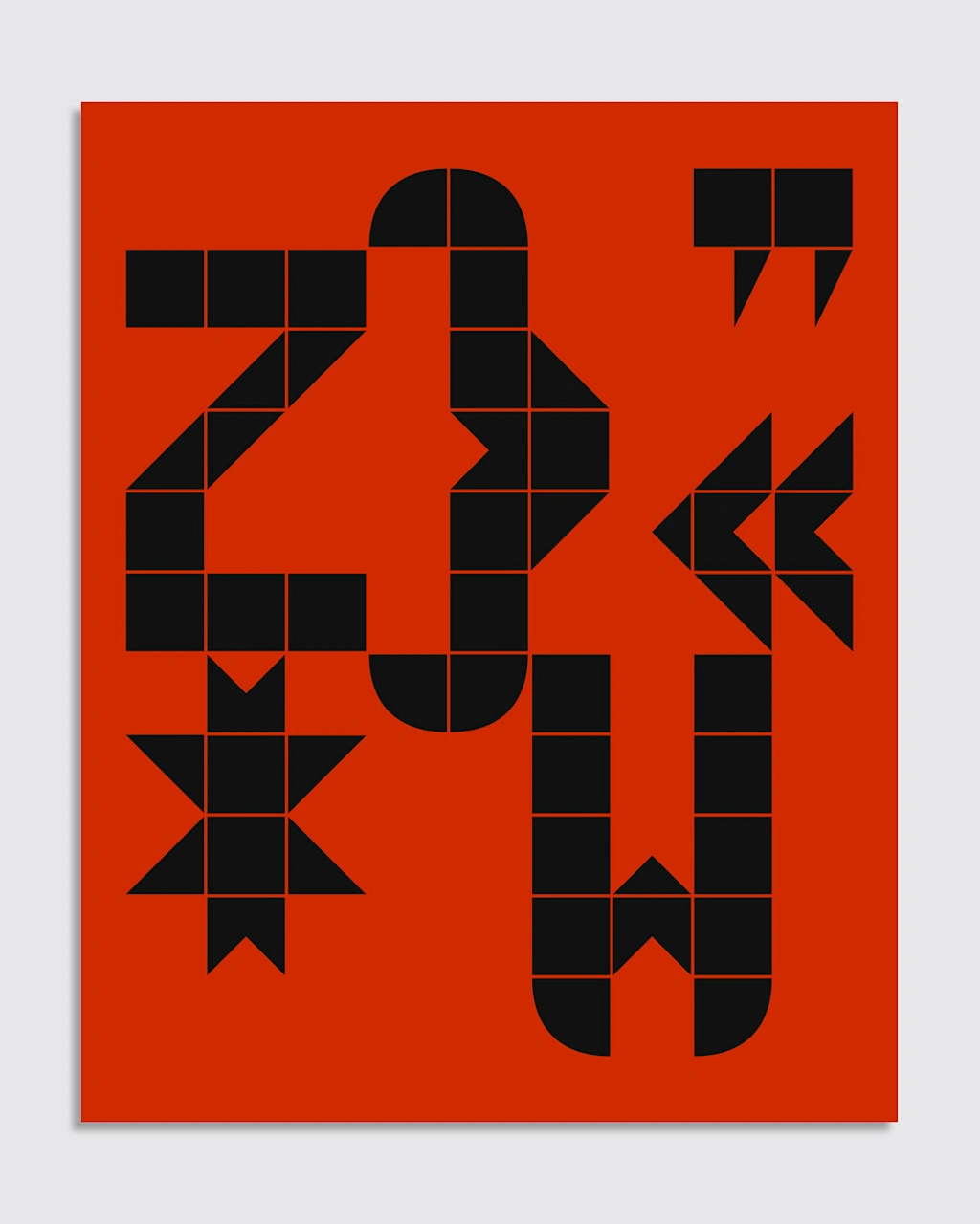
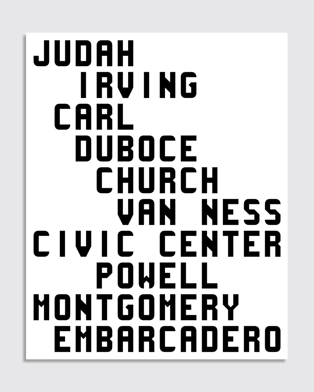
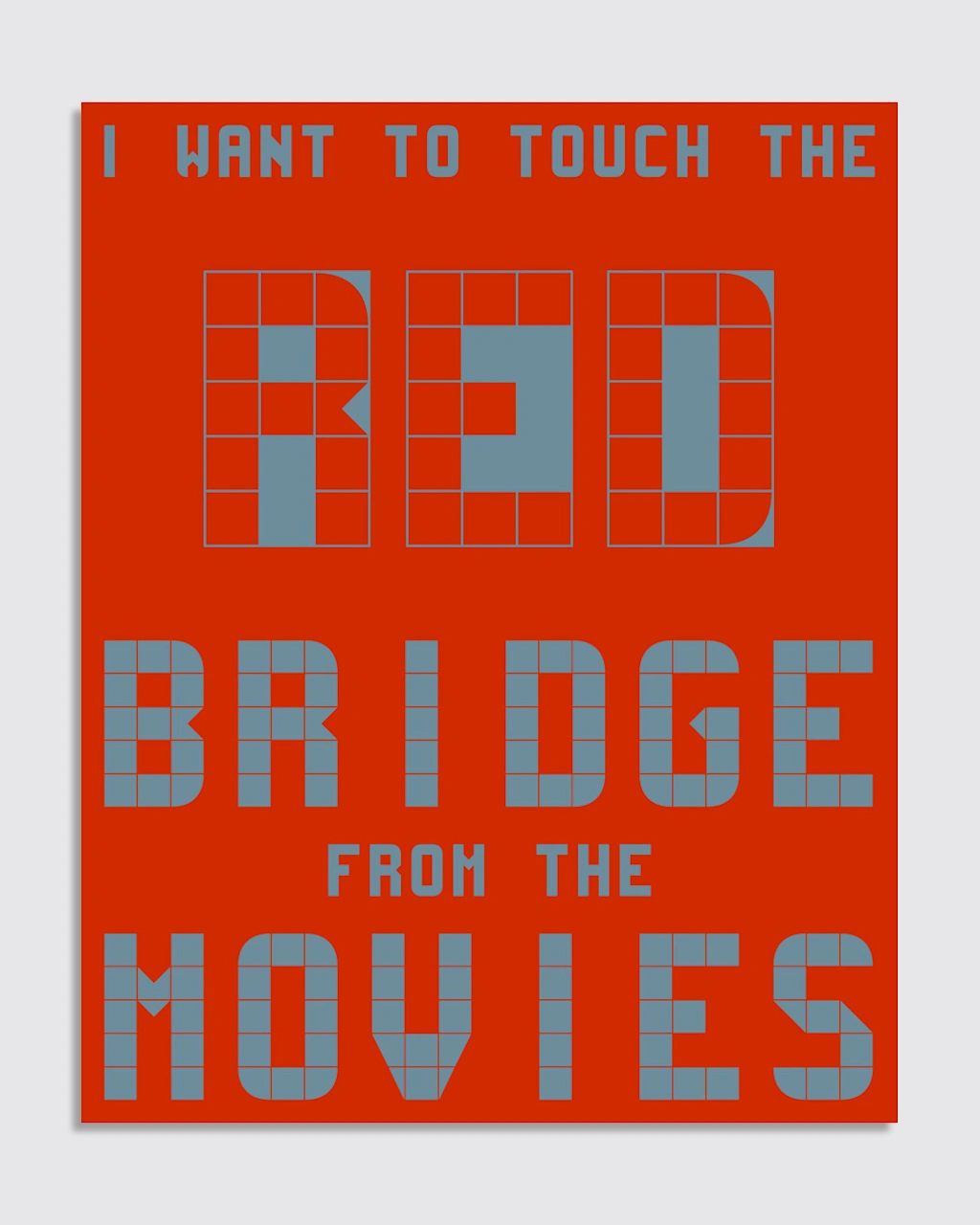
The original lettering on the displays didn’t have all the characters, as Muni had no need for Qs, Xs, exclamation points, or semicolons, so Sneddon had to make her own. For now there are no lowercase letters, as that would require a different grid, and she also hasn’t managed to come up with a suitable “@” sign yet. Fran Sans comes in three styles: solid, tile, and panel.
SFMTA finished replacing the Breda car with a new model this month that uses LED dot-matrix destination displays, which to Sneddon lack the character of the Breda car lettering. Fran Sans reintroduces some of those typographic quirks, like thin diagonals on the Z, 7, and M. Although those particularities can make the M look like an H at small sizes, they’re also what gives the font its charm.
There’s a perception that San Francisco is a place where people come to make their bread and leave, Sneddon says, from the gold rush in the 1800s to AI today, but moving to San Francisco taught her that there’s “a lot of community, a lot of love for the arts, and a lot of generosity” in the city.
