



And then there was Jaguar. In 2024, Jaguar also announced an electric-first future. And like Ferrari, it simultaneously ditched the design language that made Jaguar immediately Jaguar: the distinctive silhouette, the visual codes, the logo, the everything. The idea was a fresh start. A new logo for a new era. What they got was confusion and contempt. A rebrand rather than a revitalization.
Ferrari has made the same error. Vigna said the new technology required that design “must be different.”
He’s backwards.
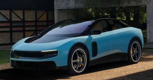
New technology makes it more urgent that your design be unmistakably, aggressively, stereotypically yours. A bridge to a new era, perhaps. But a bridge that starts unmistakably from the Maranello side of the river. The Luce should scream Ferrari even as it whispers about batteries and range. The silhouette should be instantly recognizable and lean. The presentation should drip in red. The Prancing Horse should be unmissable. The name should carry aggression. And this first pure electric entry should have been, had to have been, a sportscar. Instead Ferrari just made its first five seater. Che cosa?
When everything you do is new and different, your brand codes matter most. They’re the thing that anchors the audience to what they know. Hermès understood it. Apple understood it. Burberry understood it. Ferrari and Jaguar didn’t. But consumers do. They didn’t reject the Luce because it’s electric. That’s a ridiculous idea in 2025. They rejected it because it doesn’t look like a Ferrari. And when you are pushing the boundaries of the category that is even more important than usual.

