


When Asha Sharma took over as CEO of XBox in February, many worried her lack of a gaming background was a bad portent for a brand already trounced by Sony’s PlayStation and the Nintendo Switch.
But in the space of weeks, Sharma has muted most critics with popular reforms such as dropping the price of Game Pass and sacking Copilot, the AI-powered “personal gaming sidekick.”
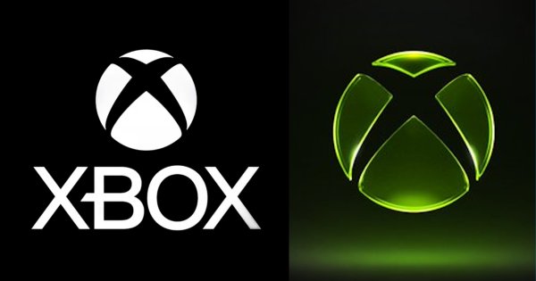
But most visible change has been a new logo.
This latest badge (XBox’s eighth since its debut 25 years ago) marks the retirement of Microsoft Gaming and a return to the standalone XBox name and its signature green.
It also emblematizes Sharma’s pledge to improve the gaming experience with an affordable, customizable platform “that connects players and creators everywhere.”
ADWEEK turned to four authorities in visual branding to see what they think about the move.
Jenn Szekely, President, Coley Porter Bell
Logos are storytelling devices, and the new Xbox logo does a good job at telling the new story and strategy of the brand. Moving away from Microsoft Gaming not only elevates the Xbox brand, but it also feels much less corporate, which is spot-on for the gaming community.
Visually, the brand needed to evolve, as the minimalist, de-branding approach that was trendy at the time the white mark was created no longer felt relevant.
The brand has done a great job creating something that feels very futuristic with its glassy finish, but also celebrates its heritage by going back to green. The move from the flat white to the radiating green makes the brand feel alive again.
Michael Guerin, senior partner, design, Lippincott
A logo can be a powerful signal, especially when paired with broader business changes. This update breathes new life into the brand without being a drastic departure from the current mark.
This update taps into a strong sense of nostalgia for Xbox. By reintroducing the early-2000s-era green and adding a sleek new sense of dimension, it marks a clear shift away from the minimalism of the previous logo refresh. For players, it can feel like a return to Xbox’s roots while still looking built for the future.
