


But because the rollout has been relatively narrow so far, it’s difficult to assess how certain changes—like the added dimension and the removal of the word ‘XBox’—will perform.
Clark Goolsby, chief creative officer, Chase Design Group
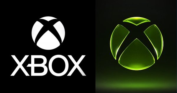
The new Xbox logo is definitely bucking current design trends, which focus on flatness and simplicity. A classic design rule of thumb is that a good logo can be printed on a pencil. Brands need to be recognized everywhere they appear, and simpler, flatter logos are easier to consistently reproduce. However, the constraints in reproduction are largely created by limitations in printing processes.
It seems that the new Xbox logo is focused on purely digital expression, which is where the majority of its consumer interactions take place. While the mark is simple, its rendering style is not. The new Xbox logo begs the question, do the old rules apply to logo design in a world without pencils?

Sophie Lutman, executive creative director, EMEA, Siegel+Gale
The translucent treatment inevitably invites comparisons to the current wave of ‘glassmorphism’ popularized by Apple and others. It raises the question: was this designed to clarify what Xbox stands for today, or primarily to signal cultural relevance and generate conversation?
The strongest gaming brands tend to create visual systems that fans can instantly recognize, rally around, and even wear as a badge of identity. From a simplicity perspective, the challenge with highly stylized visual systems is longevity. They can create immediate impact and noise, and to Xbox’s credit, this redesign has absolutely done that.
But the real test will be whether this evolution helps Xbox feel more distinctive, approachable, and community-driven long after the initial attention cycle fades.
